CHALLENGE
Power Cruise Control is an application for Android that allows you to monitor the energy consumption of electric vehicles and develop driving strategies to optimize the remaining battery. Currently PCC is designed for an audience of experienced users, but this project aims to expand the spectrum of potential users.
PROCESS
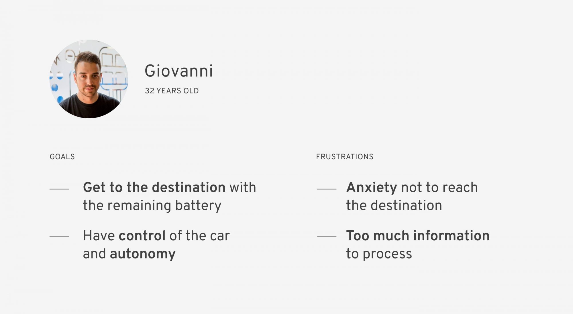
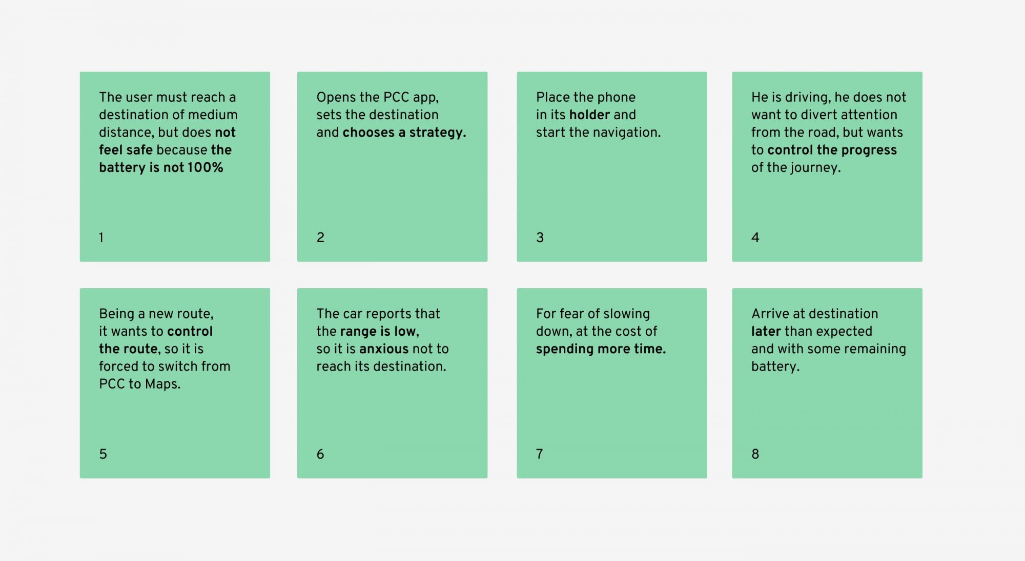
Some interviews have been carried out to better understand the methods and pain points of current users. Based on the drivers’ responses, usage scenarios have been created, in order to better understand the context of use. After having studied some themes such as legibility and driving use, numerous interface wireframes were created.
USABILITY
The solutions proposed below are specifically designed for use in cars, assuming that drivers place their smartphone in the appropriate front support.
Being committed to driving and not having the device in hand, the interactions for the user are different. As a result, the app has the responsibility not to distract the driver, but to inform him only in cases of need.
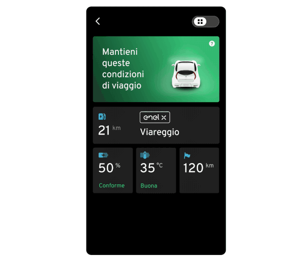
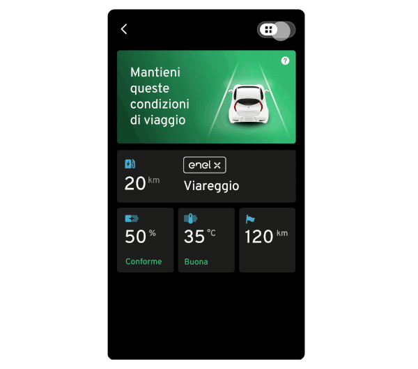
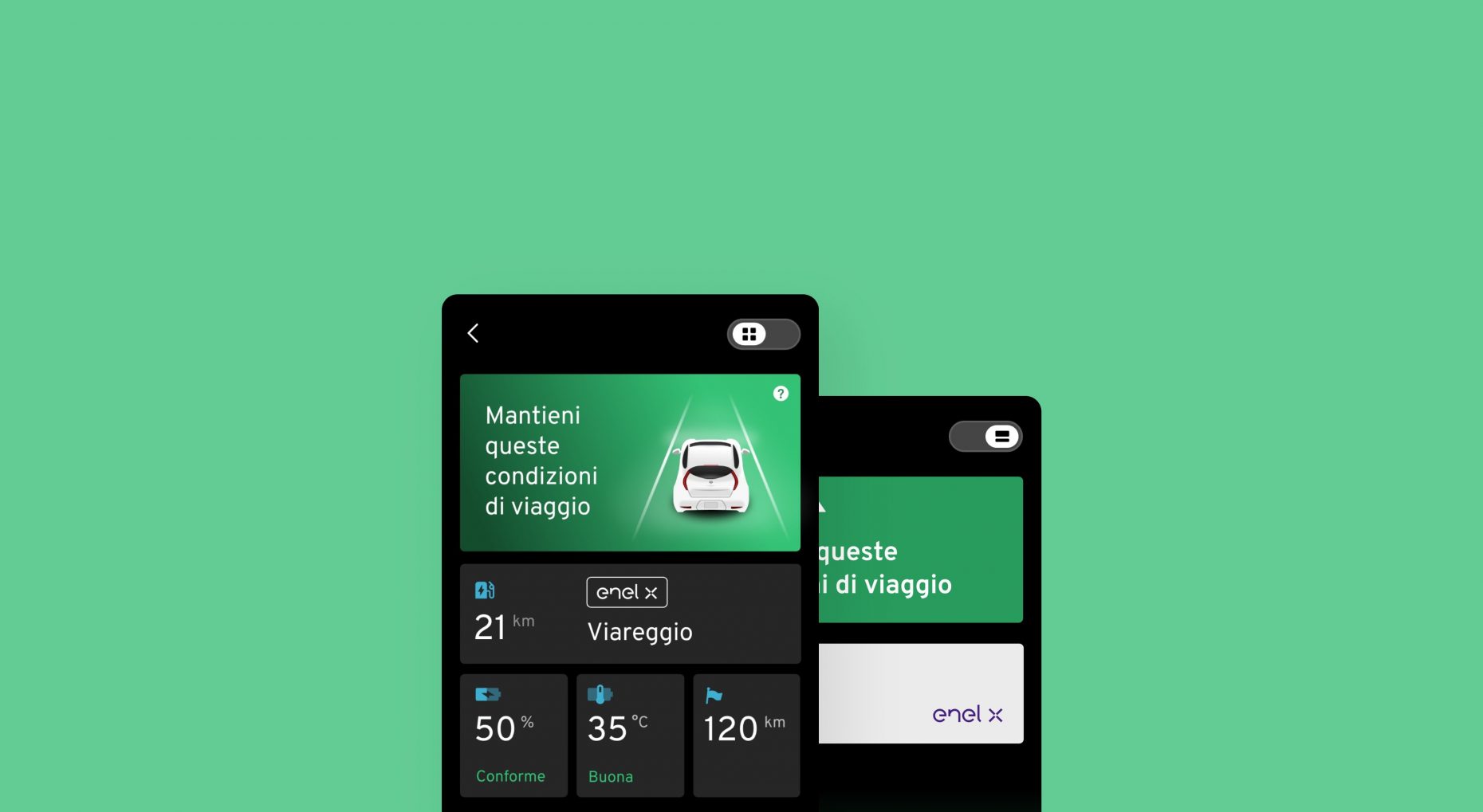
Final Design
The conversational approach invites the user to stay in the right parameters, makes the app more humane, creating security. The other fundamental data are shown in a dashboard, to show the advanced control that the app performs in monitoring the itinerary. The high contrast between background and texts increases readability, while the presence of icons make the UI immediate.
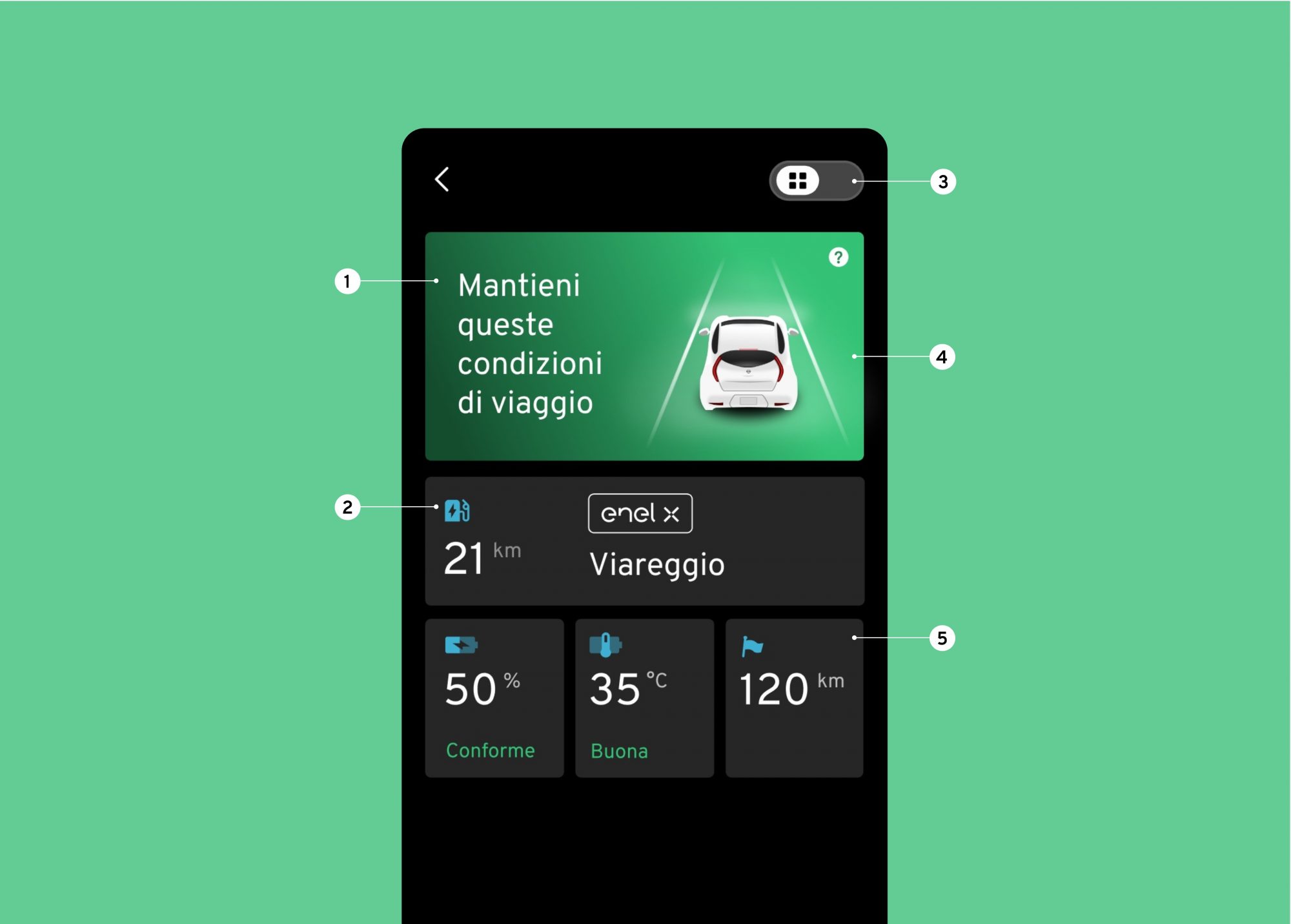
1 – This is the main tab showing the status of the driving strategy (positive green / negative orange) and a message suggesting whether to intervene or not.
2 – The second card presents information on the next charging station, useful for further reassuring the driver that he will not be without a battery.
3 – This toggle allows you to easily move to the simple view.
4 – The presence of a realistic view of the Nissan Leaf makes the application an “official” guide.
5 – The following data (battery, temperature, km on arrival) are indicated by icons and an adjective, describing the values in relation to the above trend.
6 – You can quickly switch to the dashboard view.
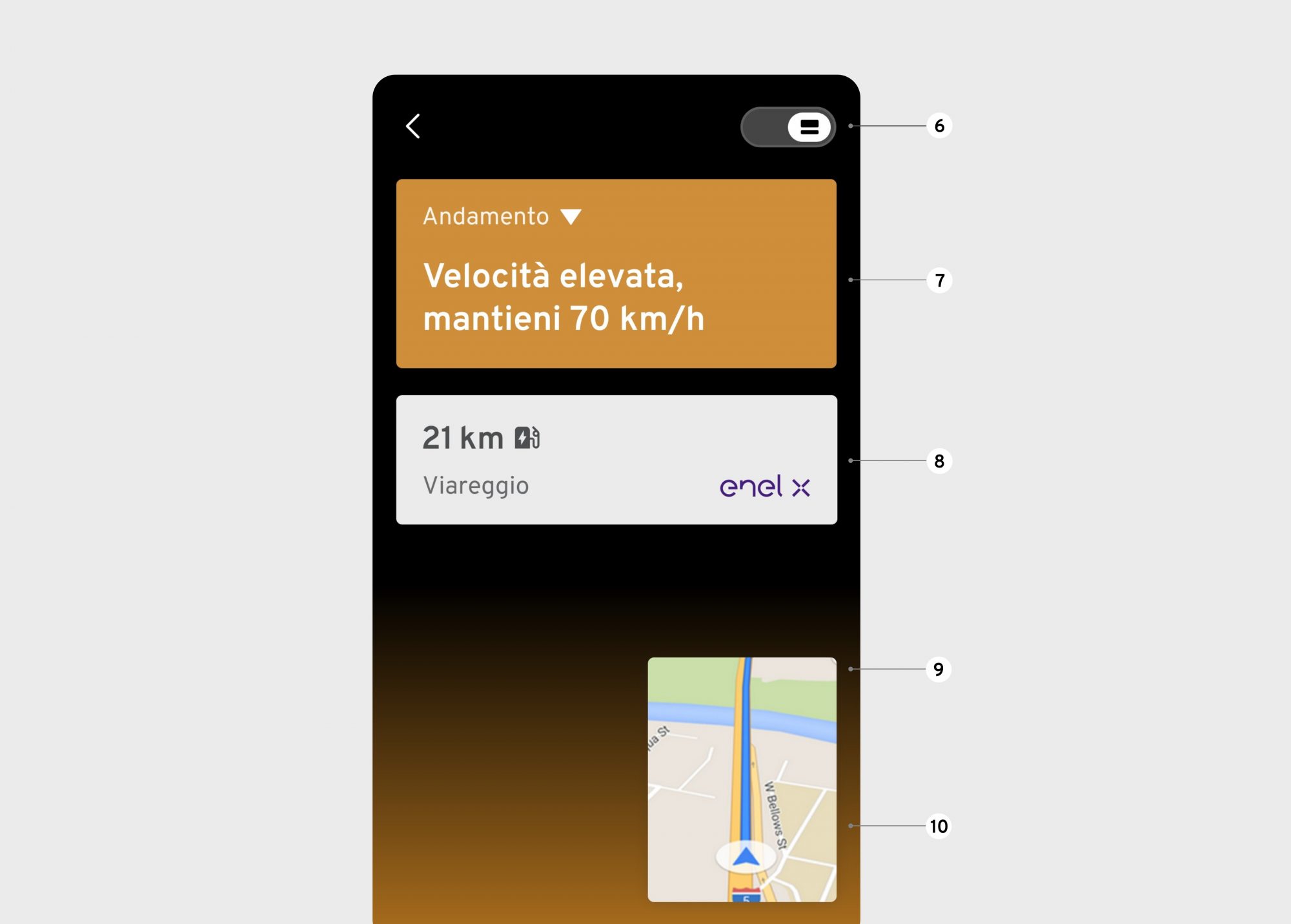
7 – The focus of this screen is the trend: it is expressed with the background color of the card (green or orange), a status icon and a practical advice.
8 – To indicate the next charging station there is a card, useful information to create security.
9 – The UI has been specifically designed to allow the use of Google Maps in the Picture-in-picture version.
10 – A further confirmation of the journey status is given by the color present in the lower part, intuitive signal.